Colour combination
When deciding on colour combinations for your home it’s useful to know colour basics and “rules” first and then you can always break them later if you feel like it!

What’s the theory then?
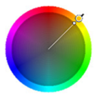
The colour wheel shows the three different types of colours – primary, secondary and tertiary. Primary colours are the three colours that cannot be made with any other colours – red, blue and yellow. Secondary colours are those made by mixing equal amounts of two primary colours. They are orange, green and purple. Tertiary colours are made by mixing a primary and a secondary colour in a ratio of 2:1. There are six types of colours schemes that you can use monochromatic, analogous, complementary, split-complementary, triadic and tetradic.
Here’s the detail on all those schemes:
Monochromatic schemes- these use different tones of the same colour, which are made by adding white or black to lighten or darken the colour. The one colour is often paired with a neutral such as white. A grey monochromatic scheme could include a dark charcoal grey sofa, pale grey walls, a mid grey television unit and a white ceiling, coffee table and cushions. An easy to manage scheme and it looks visually appealing but usually not particularly vibrant.


Analogous schemes – these schemes use colours next to each other on the colour wheel, with one colour being dominant and the others used to enhance the scheme. This is an easy to create scheme that looks richer than a monochromatic scheme. Make sure you only use a maximum of 3-4 colours as too many will confuse the scheme.

Complementary schemes – these use two colours opposite to each other on the colour wheel. Use one colour as a dominant colour and the other to highlight elements in the room. You will get the best results by using a warm and a cool colour. These schemes are high contrast and may be difficult to live with.

Split complementary schemes – these use a colour and the two colours on either side of its complimentary colour on the colour wheel. This provides high contrast but has more nuances than a complementary scheme but can be harder to balance than a monochromatic or analogous scheme.

Triadic colour schemes – using three colours equally balanced on the colour wheel. These schemes provide strong contrast but remain balanced. It’s important to choose one of the colours as the main colour.

Tetradic (double complementary) schemes – schemes using four colours – made up of two complementary pairs. You will need to again choose one colour as the dominant colour. These schemes allow the greatest colour variety but it can be tricky to balance schemes like this.
Before you choose your colour scheme identify the items in your room/ rooms that will need to stay e.g. carpets, sofas and other large items of furniture. You then need to choose colours that will work with these items – remember that when looking at a room you will see all the colours at one time (even the colours of books in a bookshelf or ornaments will change the way the room looks and how the colours work so you may need to move these around later).
Clearly you don’t need to choose one of the colour schemes above but if you’re looking for guidance or a place to start they can be helpful.
Most of the schemes above allow for an accent colour. An accent colour is a colour that adds vibrancy to a room and they are also a way of keeping decor fresh without spending a lot of money or even repainting. For instance you could have a living room painted pale grey, with grey sofas and grey walls (probably different shades of grey) and white furniture and woodwork. You can then choose an accent colour like red or pink for accessories such as cushions, picture frames, vases or throws. These can be easily changed if you want a new look.
Once you have chosen a colour for the walls paint it onto a large (A3 at least) sheet of paper and move it around your room and look at it next to your furniture, carpet and other items staying. Also check it at different times of day when the light is different in the room.
